My first draft for the cover is a bit sloppy. I’m still getting used to the drawing tablet:
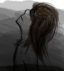
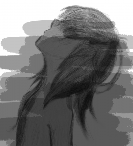
This is the second draft (not to be confused with attempt). The grey-scale makes it have less energy and vibrance. This makes it colder and creepier.
Update: Although this wasn’t used as the cover, I will use a variation of it on the 1st webpage.
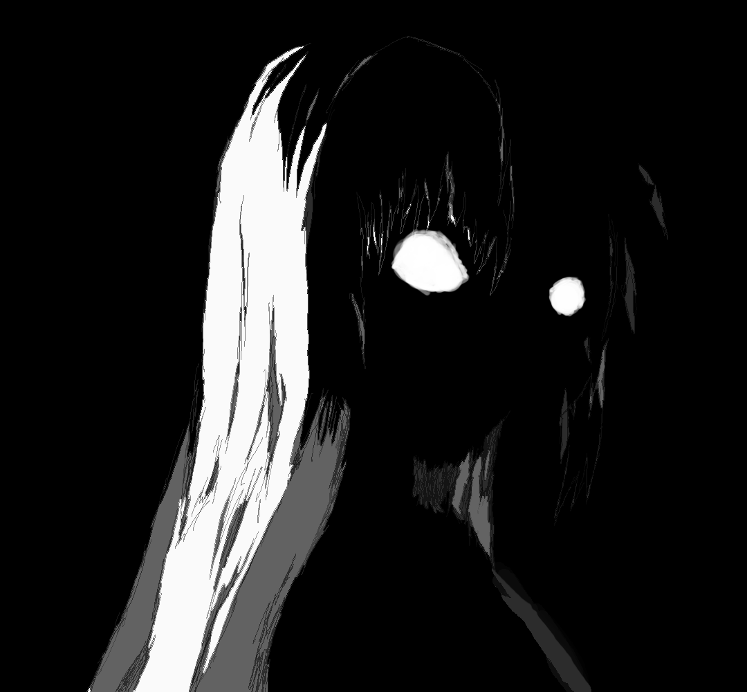
Update: This is the cover I’ve designed in the end. It still features the main character, as the other do, except she is shrouded in darkness. This, i believe, looks more closely related to other works from the horror genre.