Following Story Boards and Creating Panels


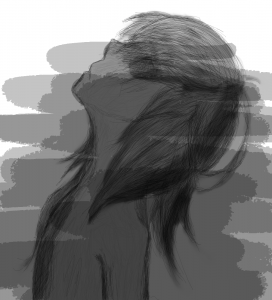
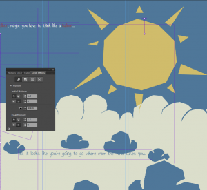
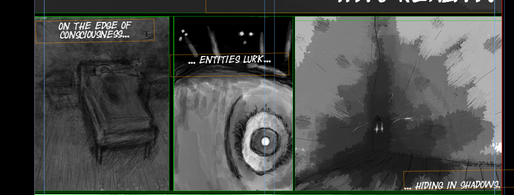
I’ve been frantically scribbling away, trying to finish these comic panels quickly so that I can apply motion to the later. Currently I’m down 3 pages . Here’s some of the stuff I’ve been up to:6
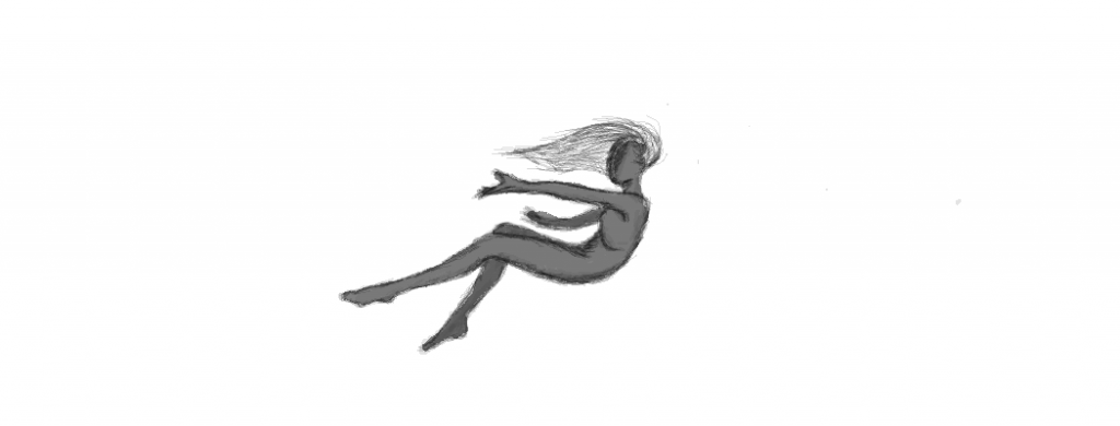
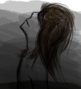
Look a bit bare? Don’t worry. This image is part of one of those animated scroll sequences. It fits in with 4 other layers to produce a moving comic panel.


7

Front Cover/ Homepage


My first draft for the cover is a bit sloppy. I’m still getting used to the drawing tablet:


Artboard 1


This is the second draft (not to be confused with attempt). The grey-scale makes it have less energy and vibrance. This makes it colder and creepier.

Update: Although this wasn’t used as the cover, I will use a variation of it on the 1st webpage.

Artboard 2


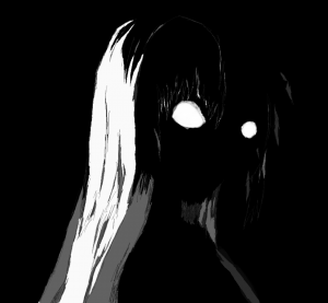
Update: This is the cover I’ve designed in the end. It still features the main character, as the other do, except she is shrouded in darkness. This, i believe, looks more closely related to other works from the horror genre.

artboard 3

New Story and Graphics

Decided the previous story and graphics weren’t working out, so I’m starting fresh with some darker and scarier graphics. I’ve booked out a drawing tablet from media loans and am going to do some crazy illustrating in photoshop. I plan to draw elaborate layers which slot together to make interactive panels in a comic-like way.


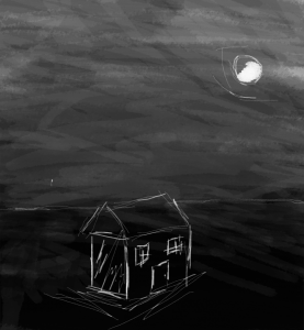
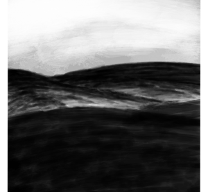
Here are some concepts for a backgrounds. You can get an indication for the tone i’m going for. It’s essentially the opposite of  balloons and penguins.


43

Update

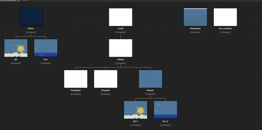
The project is now more interactive. The user has the ability to choose which path of the story they go down. Some paths will loop back to past choices and give the user the option to choose a path they didn’t go down  originally. This allows the user to view all of the content of the site, so that some pages don’t go to waste. However, there will be some pages that a user can only go to if they’ve followed a specific path.


https://www.youtube.com/watch?v=L2HQVZFEdNY&feature=youtu.be


5
site map

Parallax Back grounds

Untitled-2


Untitled-1


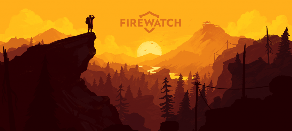
I was inspired by a cool website (http://www.firewatchgame.com/), so I’ve decided to explore parallax scrolling. Parallax is the displacement or difference in the apparent position of an object viewed along two different lines of sight. In a webpage, we can ( in essence) simulate this experience with scroll effects. By having objects scroll at different speeds, some over taking others, a parallax effect is created. This is made when imaged seem to be moving along the same point.  By This follows similar principles to the “Forced Perspective”  technique in Photoshop and after effects that I looked at very early on.

By creating a background that consists of a sandwich of similar layers (the back scrolling the slowest, and front the fastest), a parallax effect, or sense of depth in implied in the resulting image. This will be used to created visually-appealing environments.